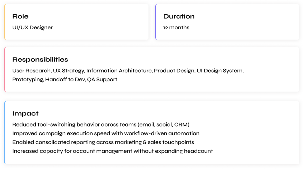
Unifying Marketing Operations: From Fragmented Tools to a Scalable Growth Engine
ManagePlus is a unified marketing automation platform built for agencies and growing businesses who struggle with fragmented workflows across email marketing, social media, WhatsApp marketing, CRM, and analytics. Instead of jumping between multiple tools, exporting spreadsheets, and reconciling customer data, ManagePlus brings everything together in one system designed for performance, visibility, and scale.
THE PROBLEM
When Marketing Tools Become the Bottleneck
Marketing agencies and in-house teams increasingly rely on multiple disconnected platforms to run their operations — one for email, one for social scheduling, one for WhatsApp, one for analytics, one for CRM, and often several for task coordination and approvals.
This creates operational friction:
- Switching between 5+ tools for core marketing workflows
- Manual data transfers via CSV sheets, WhatsApp approvals, and email threads
- Limited visibility into customer journey and ROI across channels
- Inconsistent lead ownership between marketing and sales
- Expensive subscription stacks for fundamental workflows
For many teams, the problem wasn’t that tools didn’t exist — it was that tools didn’t talk to each other
MY APPROACH
Understanding Workflows, Not Just Screens
To design ManagePlus effectively, I needed to understand why marketing teams struggle with existing tools, not just what features they use.
Since ManagePlus combines social media, email marketing, WhatsApp, and CRM into one platform, the risk wasn’t poor UI — it was poor alignment with how users think and work.
I followed a mixed-methods approach to uncover:
- Real operational bottlenecks
- Mental models of marketing teams
- Gaps between marketing execution and sales follow-up
Primary Research
- Stakeholder & Internal User Interviews
Interviews with marketing managers, agency owners, and internal users involved in product and sales to understand real-life workflows and friction points.
- Workflow Mapping Sessions
Broke down how teams currently plan campaigns, execute across tools, track performance, and hand over leads to sales.
- Feature Usage Observation
Observed how users interacted with early versions of Social Media Studio, Email Studio, and CRM features to identify confusion, redundancy, and drop-offs.
Secondary Research
- Competitive Analysis
Studied tools like Mailchimp, HubSpot, Zoho, Aisensy, and Bravo to understand:- How features were structured
- Where context was lost between tools
- Why users still relied on spreadsheets and manual work
- Support & Feedback Analysis
Reviewed early user feedback, onboarding questions, and sales conversations to identify recurring usability and clarity issues.
Why Agencies & Power Users First?
Marketing agencies and team-based businesses were the heaviest users of ManagePlus.
They managed multiple clients, multiple channels, and multiple team members — if the product worked for them, it would naturally scale down for smaller teams.
Budget and timeline constraints limited large-scale external research, so I focused on:
What the Research Revealed
Three key insights shaped the entire product direction:
1. Tool Switching Was the Real Bottleneck
Users weren’t struggling because individual tools were weak —
they struggled because nothing was connected.
- Campaign planning happened in one tool
- Execution happened in another
- Reporting lived somewhere else
- Sales never had full context
I know what I want to do, but I lose time just moving data between tools.
This revealed that integration and continuity mattered more than adding more features.
2. Fragmented Data Broke the Customer Story
Marketing teams couldn’t see:
- What content a lead engaged with
- Which emails were opened
- When a prospect became sales-ready
Data existed, but it was scattered.
This led to:
- Poor personalization
- Weak lead scoring
- Low confidence during sales handoff
Users didn’t want more dashboards —
they wanted a single, continuous customer timeline.
3. Existing Systems Didn’t Scale With Teams
Most tools worked for:
- Single brands
- Solo marketers
- Linear workflows
But agencies needed:
- Multi-business switching
- Shared assets
- Role-based collaboration
- Clear accountability
Without thoughtful structure, scaling teams meant scaling confusion.
Turning Insights Into Direction
These findings shaped three core design principles that guided every UX decision:
1. Workflow-First Design
Design around how work flows, not around individual features or tools.
- Campaigns instead of isolated actions
- Contacts instead of disconnected leads
- Timelines instead of static reports
2. Unified Visibility
Ensure users can see:
- What’s happening
- Why it’s happening
- What to do next
All without switching platforms or exporting data.
3. Scalable Simplicity
Support complex use cases without overwhelming the interface by:
- Progressive disclosure
- Reusable patterns across studios
- Clear separation between global and business-level actions
THE SOLUTION
Designing One System Instead of Three Tools
The research made one thing clear:
ManagePlus didn’t need better-looking features — it needed a better foundation.
Most competitors treated email, social media, and CRM as separate products stitched together.
I wanted ManagePlus to feel like one continuous workflow, not three disconnected dashboards.
I brought a workflow-first, system thinking approach, while the product and marketing teams contributed deep business and customer knowledge.
This collaboration was critical —
UX ensured usability and clarity, while stakeholders ensured the solution aligned with real marketing operations.
Neither perspective alone would have created a scalable platform.
Key Structural Decisions
Instead of adding more features, I focused on reducing friction between actions.
Core product decisions:
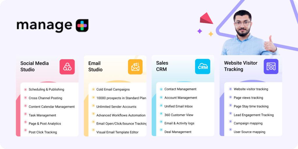
- Consolidated all marketing activities into four clear studios Social Media Studio, Email Studio, WhatsApp, Sales CRM
- Replaced tool-based navigation with task-based navigation
- Eliminated repetitive setup flows across modules
- Standardised UI patterns (tables, filters, editors, analytics layouts)
- Created a shared contact database across all studios
- Introduced a 360° customer timeline instead of isolated activity logs
- Designed reusable components to ensure consistency and faster scaling
Rather than designing each module separately, I treated the platform like one ecosystem with shared context.
This ensured users never felt like they were “switching tools” — even when changing functions.
Translating Workflows Into Product Structure
I mapped real-life marketing workflows first:
Plan → Create → Publish → Track → Nurture → Convert
Then aligned each step to the platform.
This led to:
- Campaign calendars for planning
- Unified content creation flows
- Centralized analytics dashboard
- Shared contacts & segmentation
- Direct handoff from marketing to CRM
Every screen answered one question:
“What does the user need to do next?”
Not
“Which feature should they open?”
That shift drastically simplified decision-making inside the product.
Testing, Learning, Refining
Instead of shipping everything at once, I worked iteratively with continuous feedback.
We ran multiple prototype and internal testing cycles with:
- Marketing managers
- Agency teams
- Sales users
- Internal stakeholders
Round 1 Findings
- Too many actions visible at once → cognitive overload
- Navigation between studios felt heavy
- First-time users struggled to understand feature hierarchy
Round 1 Changes
- Introduced progressive disclosure (show only what’s needed)
- Simplified left navigation
- Grouped actions by workflows instead of feature lists
- Reduced dashboard clutter
Round 2 Findings
- Switching between accounts/clients was slow
- Reporting scattered across different sections
- Repetitive form fields across tools
Round 2 Changes
- Added quick account/business switcher
- Unified analytics structure across studios
- Built shared templates & reusable blocks
- Standardized form patterns
Round 3 Validation
- Faster task completion
- Smoother onboarding
- Less dependency on training
Users reported they could:
- Launch campaigns faster
- Track leads without spreadsheets
- Move from marketing to sales without losing context
The experience started to feel predictable and cohesive, which was the main goal.
Designing for Scale, Not Just Today
One major challenge was ensuring the system could grow.
ManagePlus wasn’t a single-feature product — it would continuously expand with:
- New automations
- More integrations
- More clients per account
- More team collaboration
If the foundation wasn’t flexible, complexity would eventually break the UX.
So I focused on:
- Modular components
- Reusable patterns
- Consistent layouts
- Extensible navigation
- Scalable data architecture
This made it easier to add features later without redesigning the entire experience.
When Business Needs Meet User Needs
The Mid-Project Constraint
As the product matured, the business introduced new requirements:
- Multi-account management for agencies
- Higher sending limits
- More advanced segmentation
- Deeper analytics
These were business-critical but risked overwhelming the interface.
Initially, this felt like feature bloat.
But instead of adding more screens, I reframed the problem:
How might we increase power without increasing complexity?
Finding the Balance
My approach:
- Hide advanced controls behind progressive options
- Use smart defaults for beginners
- Keep core actions visible
- Surface complexity only when needed
Rationale:
- Protect first-time users from overwhelm
- Keep speed for experienced users
- Maintain visual clarity
- Support both small businesses and agencies
This allowed ManagePlus to serve simple and advanced users within the same system without fragmenting the product.
The Result
What we built wasn’t just a marketing tool.
It became:
- A single source of truth for customer data
- A unified marketing execution platform
- A bridge between marketing and sales
Instead of juggling 5+ tools, users could run their entire workflow in one place — smoothly and predictably.
CHALLENGES & LEARNINGS
What This Project Taught Me
Designing ManagePlus wasn’t just about building features —
it was about designing a system that multiple marketing teams would rely on daily.
Working on a multi-product SaaS platform exposed me to real-world complexity:
conflicting priorities, limited resources, scaling decisions, and continuous iteration.
If I could redo this project, here’s what I’d approach differently.
1. Push harder for external user research
Most early feedback came from internal stakeholders and a few agency partners.
While helpful, they were already familiar with marketing tools.
First-time users and small business owners had very different mental models.
In hindsight, I would push for:
- more external usability tests
- onboarding studies
- beginner-focused testing
Because power users don’t represent everyone.
2. Validate onboarding earlier
We focused heavily on core workflows first (campaigns, CRM, automation).
But onboarding clarity directly impacts adoption.
Some early users still needed guidance to understand:
- where to start
- which studio to use first
- how modules connect
If redesigned today, I’d invest earlier in:
- guided tours
- templates
- setup wizards
- “first success” moments
Good onboarding reduces support more than adding features.
3. Avoid feature-first thinking
As the product grew, requests kept coming:
“Add this tool”
“Add this report”
“Add this integration”
It’s tempting to keep stacking features.
But I learned:
More features ≠ more value
Every addition increases cognitive load.
Now I prioritize:
- simplifying workflows
- merging steps
- removing redundancy
before adding anything new.
4. System design beats screen design
At first, I approached each module independently:
Email screens
CRM screens
Social screens
But this created inconsistencies.
The breakthrough came when I shifted to designing shared systems:
- common components
- unified patterns
- reusable layouts
This made the product feel cohesive and easier to scale.
I now treat SaaS products as ecosystems, not pages.
5. Constraints can improve clarity
We constantly faced limits:
- small team
- tight timelines
- engineering bandwidth
- growing feature scope
Initially, these felt like blockers.
But they forced smarter decisions:
- simpler flows
- reusable components
- fewer but higher-impact features
Constraints helped us focus on what truly mattered.
6. Collaboration is a design tool
This wasn’t a solo design exercise.
Working closely with:
- developers
- marketing teams
- sales users
- founders
gave me context I couldn’t get from research alone.
Some of the best improvements came from conversations, not wireframes.
I learned that:
Great UX is co-created, not designed in isolation.
7. Measurement proves real impact
Early on, success felt subjective:
“The product looks cleaner”
“Feels easier”
But that’s not enough.
Design decisions need measurable outcomes.
Now I always think in terms of:
- task completion speed
- adoption rate
- reduced tool switching
- fewer manual processes
- increased campaign output
Without measurement, design becomes decoration.
With measurement, design becomes strategy.
8. SaaS products are never ‘done’
Unlike landing pages, SaaS tools evolve continuously.
Every release changes behavior.
Every new feature affects existing flows.
I learned to design for:
- scalability
- extensibility
- future growth
instead of “final” solutions.
ManagePlus isn’t a finished project — it’s a living system.
And that mindset changed how I approach product design forever.
Final Thoughts
Looking back at ManagePlus, this wasn’t just a feature design project.
It was my first time designing a complete SaaS ecosystem —
where social media, email marketing, and CRM had to work as one continuous experience.
What started as “building marketing tools” slowly became
designing workflows, systems, and behaviors.
This project reshaped how I think about UX.
Not as screens.
Not as visuals.
But as business problems solved through structure and clarity.
3 Core Principles
Workflow is strategy, not features
When I started, I thought the goal was to design better dashboards and add more capabilities.
But users didn’t struggle because features were missing.
They struggled because their workflow was broken across tools.
No amount of visual polish can fix a fragmented process.
The real solution was:
- connecting data
- reducing context switching
- aligning screens to real tasks
Designing around workflows instead of features changed everything.
This taught me to always fix the system first, UI second.
Research prevents assumptions, iteration prevents complexity
Marketing teams sounded similar on paper, but behaved very differently in reality.
Agencies needed multi-client control.
Small businesses wanted simplicity.
Sales teams cared about history and context.
If we had designed based only on assumptions, we would have shipped a bloated, confusing product.
Continuous testing and iteration helped us:
- simplify navigation
- remove unnecessary steps
- hide complexity behind smart defaults
- prioritize what truly mattered
Every round made the product smaller, not bigger — and better because of it.
Good UX is often about removing, not adding.
Impact requires measurable outcomes
Early in my career, I would have judged success by:
“Does it look clean?”
“Does it feel modern?”
Now I measure success by:
“Did it make work easier?”
Because for SaaS products, design isn’t decoration — it directly affects:
- time saved
- team productivity
- campaign speed
- business growth
ManagePlus taught me to think in outcomes, not aesthetics.
Design decisions should always tie back to:
efficiency, clarity, and real business value.
Without measurement, design is opinion.
With measurement, design becomes strategy.
Closing Note
ManagePlus continues to evolve, but the foundation we built allows it to grow without breaking.
And that’s what I’m most proud of.
Not just the screens —
but a system that marketing teams can rely on every day to plan, execute, and scale their work.
This project reminded me why I love UX:
Turning messy, fragmented processes
into simple, confident experiences
that genuinely make people’s work easier.